> ## Documentation Index
> Fetch the complete documentation index at: https://algolia.com/llms.txt
> Use this file to discover all available pages before exploring further.
# Styling and theming
> Learn how to customize React InstantSearch appearance using CSS variables and themes.
export const FlavorSwitcher = ({current, baseHref = "", options = [], label = "InstantSearch framework"}) => {
if (options.length === 0) {
return
InstantSearch.css provides a set of themes to style your search experiences with minimal effort. The themes are designed to be customizable through [CSS variables](https://developer.mozilla.org/en-US/docs/Web/CSS/Using_CSS_custom_properties) (CSS custom properties), allowing you to match your brand identity while maintaining the core layout and features.
CSS variables are currently only supported for [`chat`](/doc/api-reference/widgets/chat/react) and [`autocomplete`](/doc/api-reference/widgets/autocomplete/react) widgets.
## Loading themes
InstantSearch.css includes two main themes:
* **`satellite.css`** - A complete theme with modern styling
* **`algolia.css`** - Algolia-branded theme
Both themes include `reset.css`, a minimal reset theme that provides base styles.
### Use a CDN
The themes are available on jsDelivr:
```html HTML icon=code-xml theme={"system"}
```
### Using npm
```sh npm theme={"system"}
npm install instantsearch.css
```
```sh yarn theme={"system"}
yarn add instantsearch.css
```
Then import it in your React app:
```jsx React icon=code theme={"system"}
// Satellite theme
import 'instantsearch.css/themes/satellite.css';
// Or Algolia theme
// import 'instantsearch.css/themes/algolia.css';
```
### Loading individual component styles
If you only need specific components, you can import their styles individually to reduce bundle size. This is currently available for `chat` and `autocomplete` components:
```jsx React icon=code theme={"system"}
// Import only chat component styles
import 'instantsearch.css/components/chat.css';
// Or import the minified version
// import 'instantsearch.css/components/chat-min.css';
```
```jsx React icon=code theme={"system"}
// Import only autocomplete component styles
import 'instantsearch.css/components/autocomplete.css';
// Or import the minified version
// import 'instantsearch.css/components/autocomplete-min.css';
```
Individual component styles include all CSS variables and theming capabilities of the full themes. You can still customize them using the same CSS variable overrides.
## Development tools
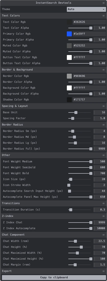
InstantSearch.css provides developer tools that help you customize CSS variables visually in your browser. The developer tools display an interactive panel where you can:
* Modify CSS variables in real-time
* Toggle between theme modes (Auto, Light, Dark)
* Export your customized variables to clipboard
### Use the developer tools
Import the developer tools in your React app:
```jsx React icon=code theme={"system"}
import 'instantsearch.css/devtools/inject';
```
The developer tools panel will appear in the bottom-left corner of your browser, allowing you to interactively customize colors, spacing, typography, and more.
The developer tools are intended for development only. Don't include them in your production build.
### Programmatic usage
You can also create the developer tools programmatically with custom options:
```jsx React icon=code theme={"system"}
import { createInstantSearchDevtools } from 'instantsearch.css/devtools';
createInstantSearchDevtools({
// Optional: custom container
container: document.getElementById('devtools'),
// Optional: custom styling
style: {
position: 'fixed',
top: '1rem',
right: '1rem',
zIndex: '1000',
},
});
```
## Customization example
You can override any CSS variable to match your brand:
```css CSS icon=paintbrush theme={"system"}
:root {
/* Brand colors */
--ais-primary-color-rgb: 124, 58, 237;
/* Spacing */
--ais-spacing-factor: 1.5;
}
```
## Dark mode
The themes support dark mode in two ways:
### Using data-theme attribute
```jsx React icon=code theme={"system"}
function App() {
return (
{/* Your widgets */}
);
}
```
### Using CSS class
```jsx React icon=code theme={"system"}
function App() {
return (
{/* Your widgets */}
);
}
```
Both approaches automatically adjust the following variables:
```css CSS icon=paintbrush theme={"system"}
:root[data-theme='dark'],
.dark {
/* Text colors */
--ais-text-color-rgb: 255, 255, 255;
--ais-primary-color-rgb: 110, 160, 255;
--ais-muted-color-rgb: 190, 190, 190;
--ais-button-text-color-rgb: 255, 255, 255;
/* Border color */
--ais-border-color-rgb: 100, 100, 100;
/* Background color */
--ais-background-color-rgb: 38, 38, 38;
/* Shadow color */
--ais-shadow-color-rgb: 0, 0, 0;
}
```
### Custom dark mode colors
You can override dark mode colors:
```css CSS icon=paintbrush theme={"system"}
:root[data-theme='dark'],
.dark {
--ais-primary-color-rgb: 147, 197, 253;
--ais-background-color-rgb: 15, 23, 42;
}
```
## Complete variable reference
For a complete list of all available CSS variables with detailed descriptions, see the tables below:
### Text colors
| Variable | Default | Description |
| ------------------------------- | --------------- | ------------------------------------ |
| `--ais-text-color-rgb` | `38, 38, 38` | RGB values for the base text color |
| `--ais-text-color-alpha` | `1` | Alpha value for the base text color |
| `--ais-primary-color-rgb` | `30, 89, 255` | RGB values for the accent color |
| `--ais-primary-color-alpha` | `1` | Alpha value for the accent color |
| `--ais-muted-color-rgb` | `82, 82, 82` | RGB values for muted/secondary text |
| `--ais-muted-color-alpha` | `1` | Alpha value for muted/secondary text |
| `--ais-button-text-color-rgb` | `255, 255, 255` | RGB values for button text |
| `--ais-button-text-color-alpha` | `1` | Alpha value for button text |
### Border, background, and shadow colors
| Variable | Default | Description |
| ------------------------------ | --------------- | ---------------------------- |
| `--ais-border-color-rgb` | `150, 150, 150` | RGB values for borders |
| `--ais-border-color-alpha` | `1` | Alpha value for borders |
| `--ais-background-color-rgb` | `255, 255, 255` | RGB values for backgrounds |
| `--ais-background-color-alpha` | `1` | Alpha value for backgrounds |
| `--ais-shadow-color-rgb` | `23, 23, 23` | RGB values for shadow colors |
### Spacing
| Variable | Default | Description |
| ---------------------- | ---------------- | --------------------------------------------------- |
| `--ais-base-unit` | `16` | Base unit value to calculate font sizes and spacing |
| `--ais-spacing-factor` | `1` (tap: `1.2`) | Multiplier for spacing calculations |
| `--ais-spacing` | calculated | Computed spacing value |
### Typography
| Variable | Default | Description |
| ---------------------------- | ------- | --------------------------------------------- |
| `--ais-font-size` | `16px` | Base font size derived from `--ais-base-unit` |
| `--ais-font-weight-medium` | `500` | Medium font weight |
| `--ais-font-weight-semibold` | `600` | Semibold font weight |
| `--ais-font-weight-bold` | `700` | Bold font weight |
### Icons
| Variable | Default | Description |
| ------------------------- | ------- | ----------------- |
| `--ais-icon-size` | `20px` | Icon size |
| `--ais-icon-stroke-width` | `1.6` | Icon stroke width |
### Shadows
| Variable | Default | Description |
| ----------------- | ------------------------------------------------------------------- | ----------------------------- |
| `--ais-shadow-sm` | `0px 0px 0px 1px rgba(..., 0.05), 0px 1px 3px 0px rgba(..., 0.25)` | Small shadow for subtle depth |
| `--ais-shadow-md` | `0px 0px 0px 1px rgba(..., 0.05), 0px 4px 8px -2px rgba(..., 0.25)` | Medium shadow for cards |
| `--ais-shadow-lg` | `0 0 0 1px rgba(..., 0.05), 0 6px 16px -4px rgba(..., 0.15)` | Large shadow for modals |
### Border radius
| Variable | Default | Description |
| -------------------------- | -------- | ---------------------------- |
| `--ais-border-radius-sm` | `4px` | Small border radius |
| `--ais-border-radius-md` | `8px` | Medium border radius |
| `--ais-border-radius-lg` | `16px` | Large border radius |
| `--ais-border-radius-full` | `9999px` | Full border radius for pills |
### Transitions
| Variable | Default | Description |
| ---------------------------------- | ------------------------------ | ------------------------------- |
| `--ais-transition-duration` | `0.3s` | Duration for transitions |
| `--ais-transition-timing-function` | `cubic-bezier(0.4, 0, 0.2, 1)` | Timing function for transitions |
### Z-index
| Variable | Default | Description |
| ---------------------------- | ------- | ---------------------------------- |
| `--ais-z-index-chat` | `9999` | Z-index for chat component |
| `--ais-z-index-autocomplete` | `10000` | Z-index for autocomplete component |
### Component-specific
#### Chat component
| Variable | Default | Description |
| -------------------------------- | ------------------------------- | ---------------------------- |
| `--ais-chat-width` | `22.5rem` | Default width of chat panel |
| `--ais-chat-height` | `70%` | Default height of chat panel |
| `--ais-chat-maximized-width` | `70%` | Width when maximized |
| `--ais-chat-maximized-height` | `100%` | Height when maximized |
| `--ais-chat-margin` | `1.5rem` | Margin around chat panel |
| `--ais-chat-carousel-item-width` | `calc(var(--ais-spacing) * 10)` | Width of carousel items |
#### Autocomplete component
| Variable | Default | Description |
| ---------------------------------------- | ------- | ------------------------------------ |
| `--ais-autocomplete-search-input-height` | `44px` | Height of search input |
| `--ais-autocomplete-panel-max-height` | `650px` | Maximum height of autocomplete panel |
 ### Use the developer tools
Import the developer tools in your React app:
```jsx React icon=code theme={"system"}
import 'instantsearch.css/devtools/inject';
```
The developer tools panel will appear in the bottom-left corner of your browser, allowing you to interactively customize colors, spacing, typography, and more.
### Use the developer tools
Import the developer tools in your React app:
```jsx React icon=code theme={"system"}
import 'instantsearch.css/devtools/inject';
```
The developer tools panel will appear in the bottom-left corner of your browser, allowing you to interactively customize colors, spacing, typography, and more.