> ## Documentation Index
> Fetch the complete documentation index at: https://algolia.com/llms.txt
> Use this file to discover all available pages before exploring further.
# Federated two-column autocomplete
> Build a two-column autocomplete with recent searches, Query Suggestions, and product previews.
export const FlavorSwitcher = ({current, baseHref = "", options = [], label = "InstantSearch framework"}) => {
if (options.length === 0) {
return
FlavorSwitcher requires at least one option.
;
}
const selected = options.find(option => option.value === current) ?? options[0];
return ;
};
This example builds on the [`autocomplete`](/doc/guides/building-search-ui/ui-and-ux-patterns/autocomplete/js) widget guide.
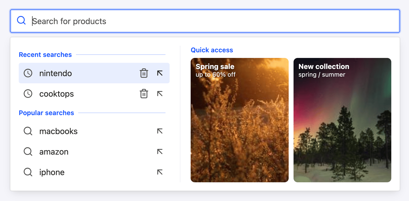
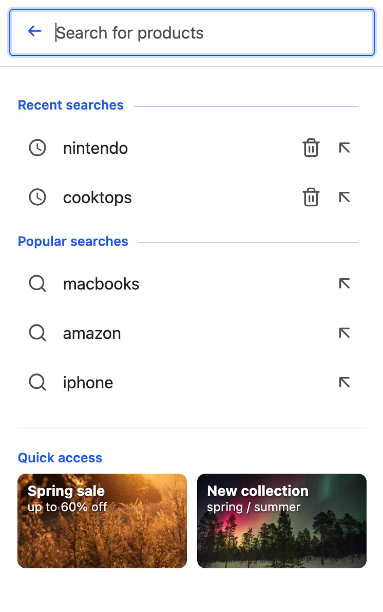
It creates a federated autocomplete experience with recent searches and Query Suggestions on the left, and product previews on the right.
 Run and edit the federated autocomplete example in CodeSandbox.
Browse the source code for the federated autocomplete example on GitHub.
The example has three states. Each one arranges the same two columns differently:
| Search state | Left column | Right column |
| --------------- | -------------------------------------------------------- | ----------------------------------------------------------------------------------------------- |
| **Empty query** | Recent searches and popular searches | Quick access |
| **Results** | Suggestions and [a category](#add-a-category-suggestion) | Product (and article) previews |
| **No results** | A "no results" message | Popular categories. To show popular categories, add a source that returns category facet values |
The sections below build each piece, then combine them in a single `panel` template.
The `panel` template arranges the sources into two columns, and each source brings its own header and item templates:
```js JavaScript icon=code expandable theme={"system"}
import { liteClient as algoliasearch } from "algoliasearch/lite";
import instantsearch from "instantsearch.js";
import { autocomplete } from "instantsearch.js/es/widgets";
import "instantsearch.css/themes/satellite.css";
const searchClient = algoliasearch(
"latency",
"6be0576ff61c053d5f9a3225e2a90f76",
);
const search = instantsearch({
indexName: "instant_search",
searchClient,
});
search.addWidgets([
autocomplete({
container: "#autocomplete",
placeholder: "Search for products",
// Left column, top: recent searches from local storage
showRecent: {
templates: {
header: (_, { html }) =>
html``,
},
},
// Left column, bottom: popular Query Suggestions
showQuerySuggestions: {
indexName: "instant_search_demo_query_suggestions",
searchParameters: { hitsPerPage: 5 },
templates: {
header: (_, { html }) =>
html``,
},
},
// Right column: product previews with image, name, price, and highlight
indices: [
{
indexName: "instant_search",
searchParameters: { hitsPerPage: 5 },
templates: {
header: ({ items }, { html }) =>
items.length === 0
? null
: html``,
noResults: (_, { html }) =>
html`
Run and edit the federated autocomplete example in CodeSandbox.
Browse the source code for the federated autocomplete example on GitHub.
The example has three states. Each one arranges the same two columns differently:
| Search state | Left column | Right column |
| --------------- | -------------------------------------------------------- | ----------------------------------------------------------------------------------------------- |
| **Empty query** | Recent searches and popular searches | Quick access |
| **Results** | Suggestions and [a category](#add-a-category-suggestion) | Product (and article) previews |
| **No results** | A "no results" message | Popular categories. To show popular categories, add a source that returns category facet values |
The sections below build each piece, then combine them in a single `panel` template.
The `panel` template arranges the sources into two columns, and each source brings its own header and item templates:
```js JavaScript icon=code expandable theme={"system"}
import { liteClient as algoliasearch } from "algoliasearch/lite";
import instantsearch from "instantsearch.js";
import { autocomplete } from "instantsearch.js/es/widgets";
import "instantsearch.css/themes/satellite.css";
const searchClient = algoliasearch(
"latency",
"6be0576ff61c053d5f9a3225e2a90f76",
);
const search = instantsearch({
indexName: "instant_search",
searchClient,
});
search.addWidgets([
autocomplete({
container: "#autocomplete",
placeholder: "Search for products",
// Left column, top: recent searches from local storage
showRecent: {
templates: {
header: (_, { html }) =>
html``,
},
},
// Left column, bottom: popular Query Suggestions
showQuerySuggestions: {
indexName: "instant_search_demo_query_suggestions",
searchParameters: { hitsPerPage: 5 },
templates: {
header: (_, { html }) =>
html``,
},
},
// Right column: product previews with image, name, price, and highlight
indices: [
{
indexName: "instant_search",
searchParameters: { hitsPerPage: 5 },
templates: {
header: ({ items }, { html }) =>
items.length === 0
? null
: html``,
noResults: (_, { html }) =>
html`No products found.
`,
item: ({ item }, { html, components }) =>
html`
${components.Highlight({ hit: item, attribute: "name" })}
${item.brand} · $${item.price}
`,
},
},
],
// Access built-in sources by their element names and index sources by index name.
templates: {
panel: ({ elements }, { html }) =>
html`
${elements.recent} ${elements.suggestions}
${elements["instant_search"]}
`,
},
}),
]);
search.start();
```
Add CSS for the columns, product rows, and state-specific elements.
The [example style sheet](https://github.com/algolia/doc-code-samples/tree/master/instantsearch.js/autocomplete/src/app.css) includes classes for:
* Two-column grids
* Product rows
* Quick-access cards
* "See all" and no-results states
## Add a quick-access panel
You can show promotional cards or shortcuts when the query is empty.
Define them as static data and render them in the `panel` template.
When users type a query, show product previews instead:
```js JavaScript icon=code expandable theme={"system"}
// Quick-access cards shown in the empty state.
const QUICK_ACCESS = [
{
title: "Spring sale",
subtitle: "up to 60% off",
image: "https://picsum.photos/seed/spring-sale/300/200",
href: "#",
},
{
title: "New collection",
subtitle: "spring / summer",
image: "https://picsum.photos/seed/new-collection/300/200",
href: "#",
},
];
templates: {
panel: ({ elements, indices }, { html }) => {
const products = indices.find(
(index) => index.indexName === "instant_search",
);
const isEmptyQuery = products?.results?.query === "";
return html`
${elements.recent} ${elements.suggestions}
${isEmptyQuery && QUICK_ACCESS.length > 0
? html`
`
: elements["instant_search"]}
`;
},
},
```
For dynamic cards, return custom data from an [Algolia rule](/doc/guides/managing-results/rules/rules-overview).
In the `panel` template, read the data from `results.userData` for the products index instead of using a static array.
## Add a category suggestion
To show a category suggestion in the left column, find the products index and read the top product's `categories` from `results.hits[0]` in the `panel` template.
Guard against a missing or empty `categories` attribute, then render the category after the suggestions:
```js JavaScript icon=code theme={"system"}
const products = indices.find(
(index) => index.indexName === "instant_search",
);
// Derive a category from the top product, if any.
const categories = products?.results?.hits?.[0]?.categories ?? [];
// In the left column, after the suggestions:
html`${elements.suggestions}
${categories.length > 0
? html`${categories.join(" › ")}
`
: null}`;
```
## Show a "See all" link
The index source has no `footer` template.
To show a **See all** link with the total number of matching results,
read the products index's `results.nbHits` in the `panel` template and render the link after the product previews:
```js JavaScript icon=code theme={"system"}
const products = indices.find(
(index) => index.indexName === "instant_search",
);
const nbHits = products?.results?.nbHits ?? 0;
// In the right column, after the product elements:
html`${elements["instant_search"]}
${nbHits > 5
? html`
See all ${nbHits.toLocaleString()} results
`
: null}`;
```
## Show the no-results state
When a result source has no items, the widget doesn't render its `item` template.
Use the source's `noResults` template to show a message such as "No products found", as shown in the main example.
## Combine the empty and typing states
The final `panel` template combines two states:
* For an empty query, show recent and popular searches in the left column and quick-access cards in the right column.
* After users enter a query, show Query Suggestions and a category in the left column and product previews in the right column.
To switch between the states:
* Remove the `header` template from `showQuerySuggestions`.
* Render the suggestions heading in the `panel` template. Use "Popular searches" for an empty query and "Suggestions" for a non-empty query.
* Show the heading only when the Query Suggestions source has results.
For the assembled `panel` template, see [`src/app.js`](https://github.com/algolia/doc-code-samples/tree/master/instantsearch.js/autocomplete/src/app.js).
## See also
* [Autocomplete](/doc/guides/building-search-ui/ui-and-ux-patterns/autocomplete/js) guide for the widget basics.
* [Rich text box with mentions](/doc/guides/building-search-ui/ui-and-ux-patterns/autocomplete/examples/mentions/js) for an example of a headless, connector-based pattern.