> ## Documentation Index
> Fetch the complete documentation index at: https://algolia.com/llms.txt
> Use this file to discover all available pages before exploring further.
# Autocomplete
> Learn how to build an autocomplete search experience with InstantSearch.js.
export const AcademyLink = ({href, title}) => {
return Learn more about: {title};
};
export const FlavorSwitcher = ({current, baseHref = "", options = [], label = "InstantSearch framework"}) => {
if (options.length === 0) {
return
FlavorSwitcher requires at least one option.
;
}
const selected = options.find(option => option.value === current) ?? options[0];
return ;
};
**Autocomplete is a ubiquitous part of most search experiences.** Search providers like Google, ecommerce sites like Amazon, and messaging apps like Slack all offer autocomplete experiences on mobile and desktop.
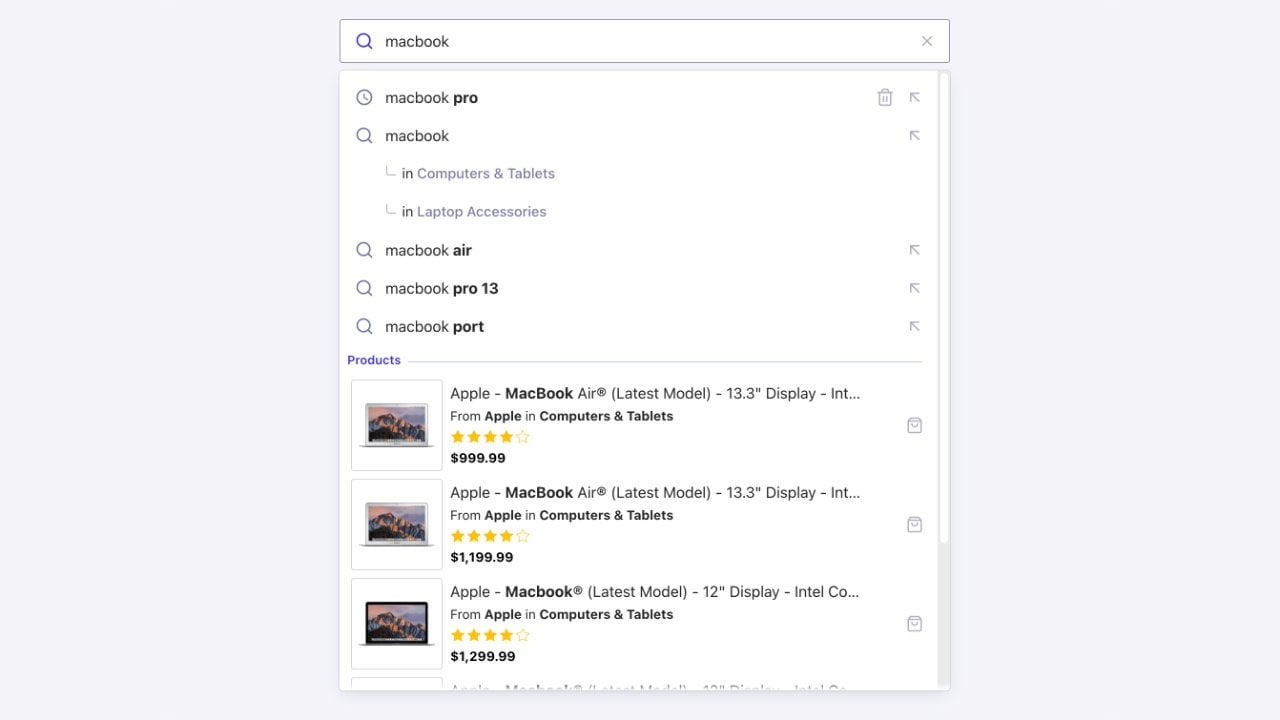 Algolia provides a full-featured solution to build autocomplete experiences with InstantSearch. The [`autocomplete`](/doc/api-reference/widgets/autocomplete/js) widget lets you build an accessible, as-you-type autocomplete user interface that you can integrate anywhere on your site or app.
Run and edit the Autocomplete example in CodeSandbox.
Browse the source for the Autocomplete example on GitHub.
A common pattern in search is to implement a search box with an autocomplete as a first step of the search experience.
**Adding an autocomplete to a search page lets you enhance the search experience and create a richer, more contextual search.**
You can use the [`autocomplete`](/doc/api-reference/widgets/autocomplete/js) widget in an existing or a new InstantSearch.js implementation to create this kind of experience.
## Install InstantSearch.js
The `autocomplete` widget is part of InstantSearch.js.
Install InstantSearch.js and the Algolia API client from the [npm](https://www.npmjs.com/) registry:
```sh npm theme={"system"}
npm install algoliasearch instantsearch.js instantsearch.css
```
```sh yarn theme={"system"}
yarn add algoliasearch instantsearch.js instantsearch.css
```
Import a theme to style the widget out of the box:
```js JavaScript icon=code theme={"system"}
import "instantsearch.css/themes/satellite.css";
```
## Add a container
The widget renders into a container element.
Add one to your markup:
```html HTML icon=code-xml theme={"system"}
```
Provide a container (for example, a `div`), not an `input`.
The widget generates a fully accessible search box for you.
## Add the widget to InstantSearch
Unlike the standalone [Autocomplete](/doc/ui-libraries/autocomplete/introduction/what-is-autocomplete) library,
the `autocomplete` widget runs inside an InstantSearch instance.
Create the instance, add the widget with [`addWidgets`](/doc/api-reference/widgets/instantsearch/js/#widget-param-addwidgets), then [`start`](/doc/api-reference/widgets/instantsearch/js/#widget-param-start) the search:
```js JavaScript icon=code expandable theme={"system"}
import { liteClient as algoliasearch } from "algoliasearch/lite";
import instantsearch from "instantsearch.js";
import { autocomplete } from "instantsearch.js/es/widgets";
import "instantsearch.css/themes/satellite.css";
const searchClient = algoliasearch(
"latency",
"6be0576ff61c053d5f9a3225e2a90f76",
);
const search = instantsearch({
indexName: "instant_search",
searchClient,
});
search.addWidgets([
autocomplete({
container: "#autocomplete",
placeholder: "Search for products",
}),
]);
search.start();
```
The widget is added to InstantSearch but it doesn't show results until you configure the indices to query.
## Display results from an index
Use the [`indices`](/doc/api-reference/widgets/autocomplete/js/#param-indices) option to define which indices to query and how to display their results.
Each index can declare its own [`templates`](/doc/api-reference/widgets/autocomplete/js/#templates) and a [`getURL`](/doc/api-reference/widgets/autocomplete/js/#param-indices) function to navigate when a user selects an item:
```js JavaScript icon=code expandable theme={"system"}
autocomplete({
container: "#autocomplete",
placeholder: "Search for products",
indices: [
{
indexName: "instant_search",
getURL: (item) => `/products/${item.objectID}`,
searchParameters: {
hitsPerPage: 5,
},
templates: {
header: ({ items }, { html }) =>
html`
Algolia provides a full-featured solution to build autocomplete experiences with InstantSearch. The [`autocomplete`](/doc/api-reference/widgets/autocomplete/js) widget lets you build an accessible, as-you-type autocomplete user interface that you can integrate anywhere on your site or app.
Run and edit the Autocomplete example in CodeSandbox.
Browse the source for the Autocomplete example on GitHub.
A common pattern in search is to implement a search box with an autocomplete as a first step of the search experience.
**Adding an autocomplete to a search page lets you enhance the search experience and create a richer, more contextual search.**
You can use the [`autocomplete`](/doc/api-reference/widgets/autocomplete/js) widget in an existing or a new InstantSearch.js implementation to create this kind of experience.
## Install InstantSearch.js
The `autocomplete` widget is part of InstantSearch.js.
Install InstantSearch.js and the Algolia API client from the [npm](https://www.npmjs.com/) registry:
```sh npm theme={"system"}
npm install algoliasearch instantsearch.js instantsearch.css
```
```sh yarn theme={"system"}
yarn add algoliasearch instantsearch.js instantsearch.css
```
Import a theme to style the widget out of the box:
```js JavaScript icon=code theme={"system"}
import "instantsearch.css/themes/satellite.css";
```
## Add a container
The widget renders into a container element.
Add one to your markup:
```html HTML icon=code-xml theme={"system"}
```
Provide a container (for example, a `div`), not an `input`.
The widget generates a fully accessible search box for you.
## Add the widget to InstantSearch
Unlike the standalone [Autocomplete](/doc/ui-libraries/autocomplete/introduction/what-is-autocomplete) library,
the `autocomplete` widget runs inside an InstantSearch instance.
Create the instance, add the widget with [`addWidgets`](/doc/api-reference/widgets/instantsearch/js/#widget-param-addwidgets), then [`start`](/doc/api-reference/widgets/instantsearch/js/#widget-param-start) the search:
```js JavaScript icon=code expandable theme={"system"}
import { liteClient as algoliasearch } from "algoliasearch/lite";
import instantsearch from "instantsearch.js";
import { autocomplete } from "instantsearch.js/es/widgets";
import "instantsearch.css/themes/satellite.css";
const searchClient = algoliasearch(
"latency",
"6be0576ff61c053d5f9a3225e2a90f76",
);
const search = instantsearch({
indexName: "instant_search",
searchClient,
});
search.addWidgets([
autocomplete({
container: "#autocomplete",
placeholder: "Search for products",
}),
]);
search.start();
```
The widget is added to InstantSearch but it doesn't show results until you configure the indices to query.
## Display results from an index
Use the [`indices`](/doc/api-reference/widgets/autocomplete/js/#param-indices) option to define which indices to query and how to display their results.
Each index can declare its own [`templates`](/doc/api-reference/widgets/autocomplete/js/#templates) and a [`getURL`](/doc/api-reference/widgets/autocomplete/js/#param-indices) function to navigate when a user selects an item:
```js JavaScript icon=code expandable theme={"system"}
autocomplete({
container: "#autocomplete",
placeholder: "Search for products",
indices: [
{
indexName: "instant_search",
getURL: (item) => `/products/${item.objectID}`,
searchParameters: {
hitsPerPage: 5,
},
templates: {
header: ({ items }, { html }) =>
html`Products (${items.length})
`,
item: ({ item, onSelect }, { html, components }) =>
html`
${components.ReverseHighlight({ hit: item, attribute: "name" })}
`,
},
},
],
});
```
You can query several indices at once by adding more objects to the `indices` array.
To learn more, see [Including multiple result types](/doc/ui-libraries/autocomplete/guides/including-multiple-result-types).
## Customize result templates
Each index renders with its own `header`, `item`, and `noResults` templates, and the widget accepts a top-level `panel` template for the overall layout.
The [Display results from an index](#display-results-from-an-index) section covers `header` and `item`.
### Highlight the matched query
Item templates receive a `components` object with `Highlight`, `ReverseHighlight`, `Snippet`, and `ReverseSnippet` helpers that emphasize the part of an attribute matching the user's query:
```js JavaScript icon=code theme={"system"}
autocomplete({
container: "#autocomplete",
indices: [
{
indexName: "instant_search",
templates: {
item: ({ item }, { html, components }) =>
html`
${components.Highlight({ hit: item, attribute: "name" })}
`,
},
},
],
});
```
Use `Snippet` to highlight within a longer, truncated attribute, and the `Reverse` variants to emphasize the text that doesn't match.
This is a common style for Query Suggestions.
### Show an empty state
The `noResults` template renders when an index returns nothing.
If any index defines it, the panel stays open even when every index is empty, so you can show a helpful message:
```js JavaScript icon=code theme={"system"}
autocomplete({
container: "#autocomplete",
indices: [
{
indexName: "instant_search",
templates: {
noResults: (_, { html }) => html`No products found.
`,
},
},
],
});
```
### Customize the panel layout
The top-level `panel` template controls the layout of the whole panel, including the order and grouping of recent searches, query suggestions, and each index.
It receives an `elements` object whose keys are `recent`, `suggestions`, and each index's `indexName`, so you can arrange sections into rows or columns—for example, suggestions on the left and results on the right:
```js JavaScript icon=code theme={"system"}
autocomplete({
container: "#autocomplete",
templates: {
panel: ({ elements }, { html }) =>
html`
${elements.suggestions}
${elements["instant_search"]}
`,
},
// ...
});
```
The template only sets the markup. Style the columns with your own CSS:
```css CSS icon=code theme={"system"}
.aa-grid {
display: grid;
grid-template-columns: 1fr 2fr;
gap: 1rem;
}
```
## Filter results
To narrow what an index returns, set Algolia [search parameters](/doc/api-reference/search-api-parameters) on that index with `searchParameters`.
You can apply [`filters`](/doc/api-reference/api-parameters/filters), [`facetFilters`](/doc/api-reference/api-parameters/facetFilters), [`numericFilters`](/doc/api-reference/api-parameters/numericFilters), and other parameters per index:
```js JavaScript icon=code theme={"system"}
autocomplete({
container: "#autocomplete",
indices: [
{
indexName: "instant_search",
searchParameters: {
hitsPerPage: 5,
filters: "categories:Phones",
facetFilters: [["brand:Apple", "brand:Samsung"]],
},
},
],
});
```
The widget applies these parameters to every query for that index.
For an interactive filter UI inside the autocomplete—such as selectable tags or facet values that users add and remove—use the standalone [Autocomplete](/doc/ui-libraries/autocomplete/guides/filtering-results) library, which provides the tags plugin and facet sources.
## Reshape and deduplicate results
Use `transformItems` to adjust results before they're displayed—for example, to remove duplicates across indices or limit the number of items each index shows.
The function receives an array with one entry per index, each shaped as `{ indexName, indexId, hits, results }`, and must return the same shape:
```js JavaScript icon=code expandable theme={"system"}
autocomplete({
container: "#autocomplete",
indices: [
{ indexName: "instant_search" },
{ indexName: "instant_search_demo_query_suggestions" },
],
transformItems(indices) {
const seen = new Set();
return indices.map((index) => ({
...index,
hits: index.hits
.filter((hit) => {
if (seen.has(hit.objectID)) {
return false;
}
seen.add(hit.objectID);
return true;
})
.slice(0, 5),
}));
},
});
```
Unlike the standalone library's [reshape](/doc/ui-libraries/autocomplete/guides/reshaping-sources) API, the widget doesn't group or sort sources for you—deduplication and per-index limits are manual, as shown above.
## Add Query Suggestions and recent searches
The widget can display query suggestions from a [Query Suggestions index](/doc/guides/building-search-ui/ui-and-ux-patterns/query-suggestions/js) and recent searches stored in the browser's local storage.
Enable them with [`showQuerySuggestions`](/doc/api-reference/widgets/autocomplete/js/#param-showquerysuggestions) and [`showRecent`](/doc/api-reference/widgets/autocomplete/js/#param-showrecent):
```js JavaScript icon=code theme={"system"}
autocomplete({
container: "#autocomplete",
placeholder: "Search for products",
showRecent: true,
showQuerySuggestions: {
indexName: "instant_search_demo_query_suggestions",
getURL: (item) => `/search?q=${item.query}`,
},
indices: [
{
indexName: "instant_search",
// ...
},
],
});
```
To customize suggestions and recent searches, set a custom storage key, or refine your main index when a user selects a suggestion,
see [Build a Query Suggestions UI](/doc/guides/building-search-ui/ui-and-ux-patterns/autocomplete/query-suggestions/js).
## Send click and conversion events
To send [click and conversion events](/doc/guides/sending-events/getting-started) when users interact with the autocomplete,
enable [`insights`](/doc/api-reference/widgets/instantsearch/js/#widget-param-insights) on the InstantSearch instance:
```js JavaScript icon=code theme={"system"}
const search = instantsearch({
indexName: "instant_search",
searchClient,
insights: true,
});
```
The widget then sends view and click events automatically when users see and select results.
Conversion events, like `add-to-cart`, usually happen after the user leaves the autocomplete, on the destination page.
Send those where the conversion occurs with the [Insights client](/doc/guides/sending-events/getting-started).
The autocomplete item template doesn't expose a `sendEvent` function.
## Support keyboard navigation
The widget renders an accessible combobox, so users can operate it entirely from the keyboard—no extra configuration:
* **Up and Down arrows** move through the items. The highlight wraps around at the ends of the list.
* **Enter** opens the highlighted item, or submits the typed query when nothing is highlighted.
* **Escape** closes the panel, then clears the highlight.
* **Tab** closes the panel and moves focus to the next element.
What happens on **Enter** depends on how you handle navigation:
* If the highlighted item's index defines [`getURL`](#display-results-from-an-index), the browser opens that URL.
* Otherwise, when you set `getSearchPageURL`, submitting the query sends the user to your search results page.
* To use client-side routing instead of a full page load, provide an `onSelect` function and handle navigation in your app.
```js JavaScript icon=code theme={"system"}
autocomplete({
container: "#autocomplete",
// On Enter with no highlighted item, open the search results page.
getSearchPageURL: ({ query }) => `/search?q=${query}`,
indices: [
{
indexName: "instant_search",
// On Enter or click with a highlighted item, open its URL.
getURL: (item) => `/products/${item.objectID}`,
},
],
});
```
The widget also sets the matching ARIA roles (`combobox`, `aria-expanded`, `aria-activedescendant`), so screen readers announce the active item as users move through the list.
## Enable detached (mobile) mode
On small screens, the widget can switch to a full-screen overlay.
Use the [`detachedMediaQuery`](/doc/api-reference/widgets/autocomplete/js/#param-detachedmediaquery) option to control when this happens.
By default, detached mode activates at `(max-width: 680px)`.
```js JavaScript icon=code theme={"system"}
autocomplete({
container: "#autocomplete",
detachedMediaQuery: "(max-width: 1024px)",
// ...
});
```
To turn off detached mode, set `detachedMediaQuery` to an empty string.
## Explore advanced examples
* [Federated two-column autocomplete](/doc/guides/building-search-ui/ui-and-ux-patterns/autocomplete/examples/federated/js): a layout that combines recent searches, Query Suggestions, product previews, a quick-access panel, and category suggestions.
* [Rich text box with mentions](/doc/guides/building-search-ui/ui-and-ux-patterns/autocomplete/examples/mentions/js): a headless "@" mentions text box, built with the [`connectAutocomplete`](/doc/api-reference/widgets/autocomplete/js) connector, that reproduces the X compose experience.
## See also
* [`autocomplete`](/doc/api-reference/widgets/autocomplete/js) widget reference for the full list of options.
* [Build a Query Suggestions UI](/doc/guides/building-search-ui/ui-and-ux-patterns/autocomplete/query-suggestions/js).