This is the React InstantSearch v7 documentation.
If you’re upgrading from v6, see the upgrade guide.
If you were using React InstantSearch Hooks,
this v7 documentation applies—just check for necessary changes.
To continue using v6, you can find the archived documentation.
- They increase facet visibility and accessibility, encouraging more usage.
- They simplify the screen, leaving more room for products and creating more on-screen breathing space, an important UX design choice.
RefinementList or a HierarchicalMenu widget, into a drop-down menu layout.
Open CodeSandbox
Run and edit the Facet drop-down menus example in CodeSandbox.
Explore source code
Browse the source for the Facet drop-down menus example on GitHub.
Widget elements
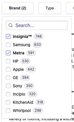
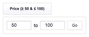
By design, each facet drop-down menu widget has two elements:- A button with a label and the number of active refinements.
- A panel (that can be toggled) containing the widget.
The facet drop-down menu widget can only contain one widget and is compatible with
DynamicWidgets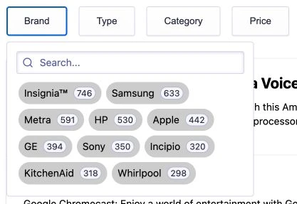
Quickstart
1
Clone the code sample
To get started, clone the code sample
and follow the instructions to install the dependencies, or fork the following CodeSandbox.In the project, you see two components:
Panel.tsxused as the drop-down menu that can be toggled. It also displays a header, wraps your provided widget and adds a footer on mobile.FacetDropdown.tsxused to get the number of active refinements for the provided widget and close the panel when the search state has changed.
To use the facet drop-down menu widget in your own project:
install or duplicate the dependencies for each widget (like the
hooks folder and utils.ts file).2
Use the facet drop-down menu widget
A basic usage of the facet drop-down menu widget:
React
FacetDropdown widget automatically retrieves the attribute of the first provided child widget to display the number of current refinements in the drop-down menu toggle button.
Props
buttonText
Type: string | function
You can use the buttonText prop to customize the text displayed in the drop-down menu button.
It can be a string or a function.
By default, it shows the number of active refinement for the provided widget.
Here’s an example showing how you can get the current refinements to display the current bounds of a RangeInput widget.
React
closeOnChange
Type: boolean | function
You can use the closeOnChange prop to close the drop-down menu as soon as users selects a facet value using a boolean or function that returns true.
If it’s false, the drop-down menu isn’t closed automatically, allowing users to select more than one facet value.
Here’s an example where the drop-down menu is automatically closed only if users are using a device with a width greater than or equal to 375px.
React
cssClasses
Type: Object
You can use the classNames prop to add CSS classes on multiple elements of the facet drop-down menu widget.
Here’s an example that adds custom CSS classes.
React
Customize the UI
The generated markup lets you customize the look and feel to your needs, to change the default aspect of the drop-down menu with a few lines of CSS. Here’s the default version: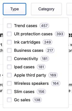
-
Inline facet values
The demo’s brand drop-down menu widget uses an inline list.
See the code in the
App.cssfile.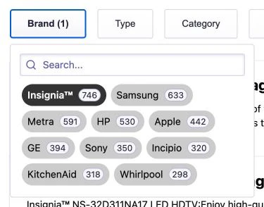
CSS
-
Fixed height drop-down menu
The demo’s category drop-down menu widget is hierarchical and is a fixed height list.
See the code in the
App.cssfile.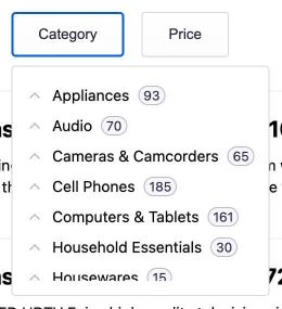
CSS
Mobile support
Mobile devices are already supported by the widget. Below 375px (this breaking point can be changed, see below):- The drop-down menu position is fixed and taking the full page size.
- The page scroll is locked when the drop-down menu is open.
- The button text is added as a title at the top of the drop-down menu.
- A button to apply the changes is added at the bottom of the drop-down menu.
CSS
TypeScript