- It increases facet visibility and accessibility, encouraging more usage.
- It simplifies the screen, leaving more room for products and creating more on-screen breathing space, an important UX design choice.
refinementList or a hierarchicalMenu, widget, into a custom widget with a drop-down menu layout.
The provided code uses InstantSearch.js, which can be taken as-is or as a reference if you want to replicate the same pattern using Vue InstantSearch.
Open CodeSandbox
Run and edit the Facet drop-down menus example in CodeSandbox.
Explore source code
Browse the source for the Facet drop-down menus example on GitHub.
Wrapper elements
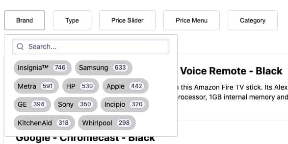
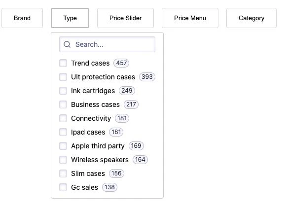
By design, each drop-down menu refinement widget wrapper has two elements:- A button with a label and facet count
- A drop-down menu box
div,
which allows multiple facets in the same container, thus creating a horizontal list.
createDropdown that takes two parameters:
- The refinement widget you want to turn into a drop-down menu
- An object for optional settings
src/Dropdown.js file, returns an InstantSearch widget that can be placed alongside other widgets on your search screen.
All examples in this guide assume you’ve included InstantSearch.js in your web page from a CDN.
If you’re using it with a package manager, adjust how you import InstantSearch.js and its widgets for more information.
JavaScript
Quickstart
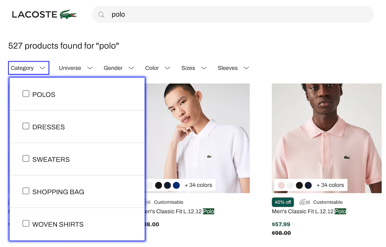
First, you create your own drop-down menu widget. Later, you customize it. To create the drop-down menu, use arefinementList widget on your type facet.
Prepare the HTML
- Import all JavaScript files, such as Algolia search, InstantSearch.js, and your own JS files.
- Declare a placeholder
divwith the IDtypefor the drop-down menu widget for thetypefacet.
index.html:HTML
Create the widget
Import the
createDropdown function from the src/dropdown.js
file before initializing an InstantSearch instance with your Algolia credentials and create the drop-down menu widget.In this case, use a refinementList widget for the type facet.
As a result, you create a customized refinementListDropdown widget for the type facet that can also be re-used for other facets.In src/app.js:JavaScript
Here,
instantsearch.widgets.refinementList refers to InstantSearch’s refinementList widget. See the widget reference guide.createDropdown function creates a widget that acts as a wrapper around the initial widget, which is passed as a parameter.
That’s why the created refinementListDropdown widget can take any of the settings available in the refinementList widget.
For example, { limit: 5, showMore: true } limits the default number of displayed facet values to “5”.
Settings
ThecreateDropdown function takes two parameters:
- Required: a refinement widget to turn into a drop-down menu
- Optional: an object with settings
JavaScript
cssClasses
Type: object
An object that lets you override the CSS class in your code.
Here’s an example with default values:
JavaScript
buttonText
Type: string | function
This is the text displayed in the DropDown button.
It can be a string or a function.
By default, it shows the price of the active price refinement.
Here’s an example from the priceMenuDropdown widget.
JavaScript
buttonClassName
Type: string
Same as buttonText, but for the button CSS class name.
Here’s an example from the priceMenuDropdown widget.
JavaScript
closeOnChange
Type: boolean | function
This argument can be a boolean or a function that returns true if you want the drop-down menu to close as soon as a user selects a value.
If it’s false, it doesn’t close automatically, thus enabling users to select more than one facet value.
Here’s an example in which the code returns true if users are using a mobile device.
JavaScript
Customize the UI
The generated markup lets you customize the look and feel to your needs, to change the default aspect of the drop-down menu with a few lines of CSS. Here’s the default version: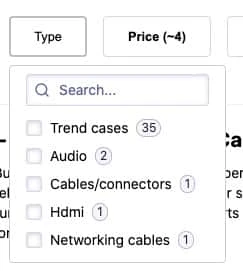
-
Inline facet values
The
brandDropdownwidget uses an inline list. See the code inapp.css.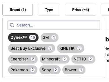
CSS
-
Fixed height drop-down menu
The hierarchical
categoriesDropdownwidget uses a fixed height list. See the code inapp.css.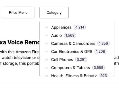
CSS
Mobile support
On mobile devices, more than anywhere else, displaying facet refinements over the results is a must-have, considering the limited real estate. Drop-down widgets are a great fit, but you need to tweak the display so they can take advantage of the screen’s width and height.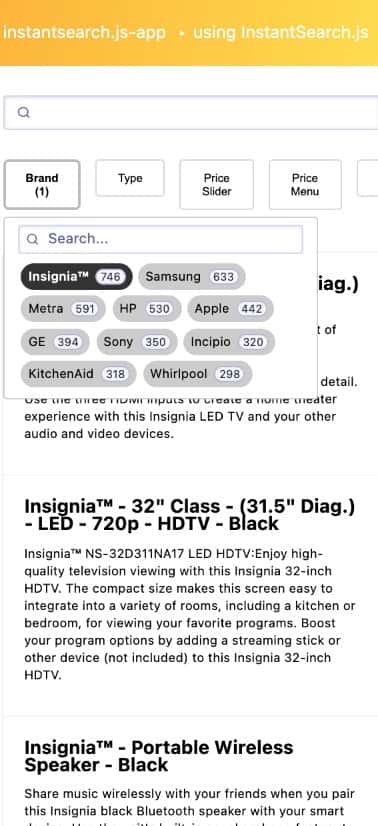
CSS
JavaScript