Autocomplete is also available as an experimental widget in InstantSearch,
making it easier to integrate into your search experience.
For more information,
see the API reference for InstantSearch.js or
React InstantSearch. 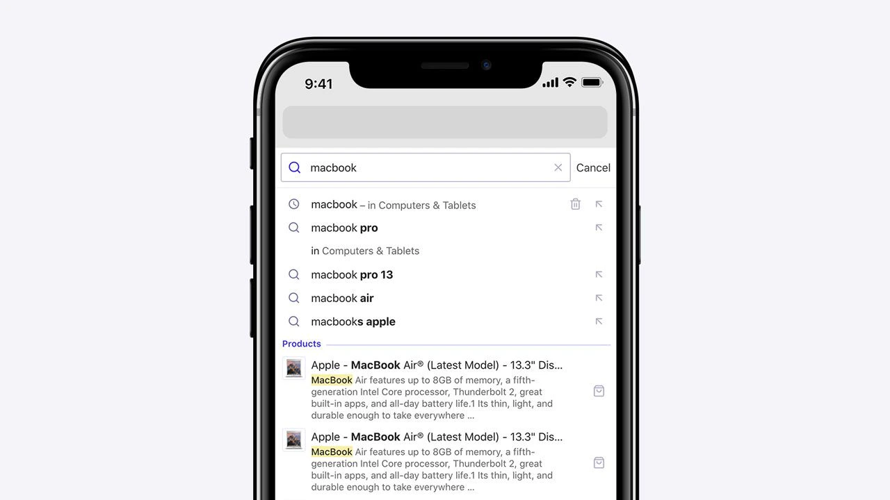 You can enable detached mode on small screens, on touch devices,
or always enable it, as seen on DocSearch.
You can enable detached mode on small screens, on touch devices,
or always enable it, as seen on DocSearch.
Detached full screen design
Autocomplete’s default behavior enables detached mode when the screen is below 500 pixels wide.
You can customize this behavior with the detachedMediaQuery option.
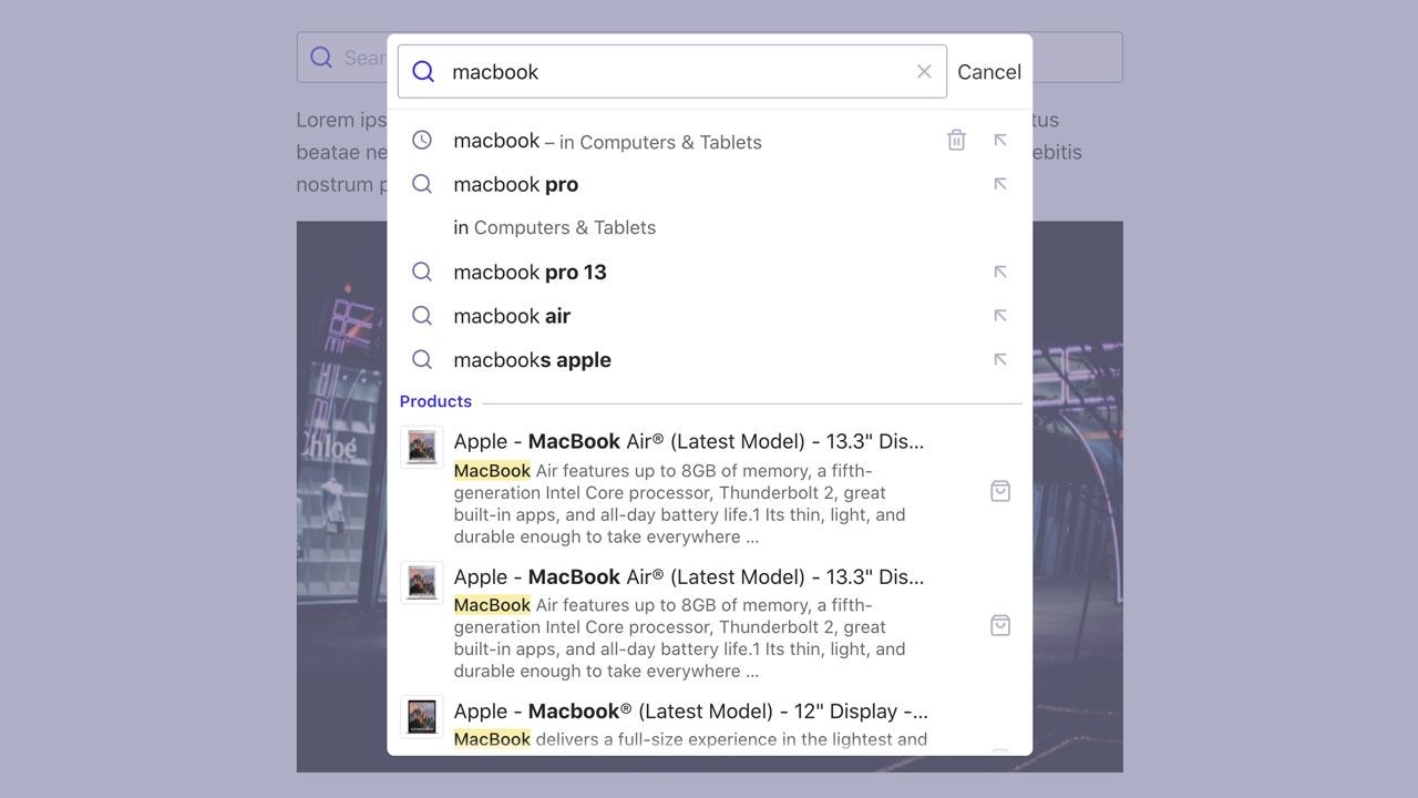
Detached modal design
Once you’re in detached mode,
you can choose to enable the modal design,
which shows the website in the background covered by an overlay.
You can set when to enable this design with the --aa-detached-modal-media-query CSS variable,
which defaults to (min-width: 500px).
Manually control detached mode
- To always turn on detached mode, set
detachedMediaQuery: ''.
- To always turn off detached mode, set
detachedMediaQuery: 'none'.
Last modified on May 19, 2026